Colour Composition
Colour in interior styling functions as both foundation and accent. We work with a palette that reflects natural light, aged materials, and the subtle shifts of tone that occur throughout the day. Our colours are not bright or bold; they are quiet, refined, and responsive to their environment.
Soft Ochre Yellow
#D6B25E
A warm, muted yellow that carries the quality of afternoon sunlight. It functions as both background and accent, providing warmth without overwhelming. This colour appears in aged paper, sun-bleached wood, and the golden tones of natural light.
Warm Linen Beige
#F3F0E8
The base tone of natural fabrics and sun-bleached walls. This colour provides rest for the eye, creating calm backgrounds against which other elements can be observed. It is the colour of unbleached linen, aged plaster, and morning light.
Light Clay Grey
#CFC9BC
A neutral tone that bridges warm and cool. This colour appears in natural stone, aged ceramics, and weathered surfaces. It provides subtle contrast without creating visual tension.
Muted Olive
#8F9B6E
An accent colour that brings depth without overwhelming. This muted green appears in aged brass, patinated surfaces, and natural materials. It functions as a quiet counterpoint to warmer tones.
Sun-Warmed Brass
#B59A5A
The colour of aged metal, warm reflections, and afternoon light on brass surfaces. This tone provides subtle warmth and reflects light in ways that change throughout the day.

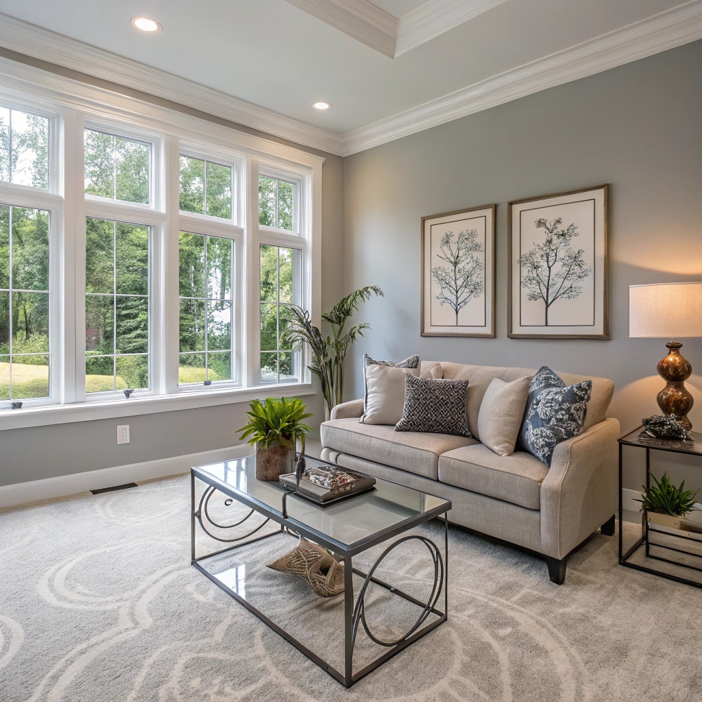
Colour relationships in natural light
Working with Colour
We approach colour not as decoration, but as a fundamental element of spatial experience. Colour affects how we perceive light, how we understand scale, and how we experience atmosphere. Our palette is intentionally limited, allowing each colour to have presence and meaning.
Colour relationships are more important than individual colours. We consider how ochre relates to linen, how olive functions as accent, how brass reflects and warms. These relationships create visual harmony and spatial coherence.
Light changes colour throughout the day. A wall that appears warm ochre in afternoon light may read as soft beige in morning light. We work with this variability, choosing colours that respond beautifully to changing conditions rather than fighting against them.

Colour responding to light
Our colour choices are informed by observation. We study how colours appear in natural settings, how they age and patinate, how they respond to different light conditions. This observational approach ensures that our colour work feels authentic and appropriate to its context.
Natural Inspiration
Our palette draws from natural materials and the subtle shifts of tone that occur throughout the day in natural light.
Limited Palette
We work with a deliberately limited palette, allowing each colour to have presence and meaning within the composition.
Light Responsive
Our colours respond beautifully to changing light conditions, creating spaces that feel alive and dynamic.
Colour Relationships
Colour relationships are more important than individual colours. We consider how ochre relates to linen, how olive functions as accent, how brass reflects and warms.
These relationships create visual harmony and spatial coherence. They guide the eye through a space, creating flow and movement while maintaining calm.
Time and Patina
Colours change over time. Materials develop patina. Surfaces age and weather. We embrace these changes, understanding that they add depth and character to a space. Our colour choices consider not only how colours appear now, but how they will age and develop over time.
Morning Light
Soft ochre appears warmest in morning light, creating a gentle, inviting atmosphere.
Afternoon Depth
Muted olive gains depth in afternoon light, providing quiet contrast to warmer tones.
Evening Warmth
Sun-warmed brass reflects evening light, creating subtle warmth and movement.
Colour as Experience
Colour is not static. It changes with light, with time, with context. We work with this variability, choosing colours that respond beautifully to changing conditions rather than fighting against them.
Our palette reflects natural materials and the subtle shifts of tone that occur throughout the day. These colours feel authentic because they are drawn from observation of the natural world.